Wassily Kandinsky’s Theory About Color and Spirituality
As a child Wassily Kandinsky learned to play the cello and piano. As an artist, he made associations between art and music. “The sound of colors is so definite that it would be hard to find anyone who would express bright yellow with base notes, or dark lake with the treble.” He wrote, “Color is the keyboard, the eyes are the harmonies, the soul is the piano with many strings. The artist is the hand that plays, touching one key or another, to cause vibrations in the soul.”
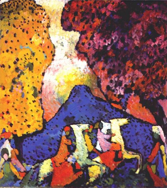
Kandinsky wrote extensively about his belief that colors and shapes could affect our mood and that it provokes a psychic vibration. “Color hides a power still unknown but real, which acts on every part of the human body.”
J. M. W. Turner and The Color Yellow
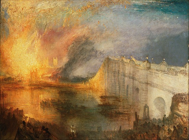
The British painter J. M. W. Turner, was an English Romantic painter, printmaker and watercolorist known for his expressive colorization and sublime sunlit seascapes. He had a strong passion for using the color yellow. This caused critics to criticize him, writing that his images were “afflicted with jaundice.” The artist used the experimental watercolor Indian Yellow, which was a fluorescent paint derived from the urine of mango-fed cows. To achieve brighter accents the artist employed the synthetic Chrome Yellow, a lead-based pigment known to cause delirium.
Helen Frankenthaler’s Innovative Evolution Using Color
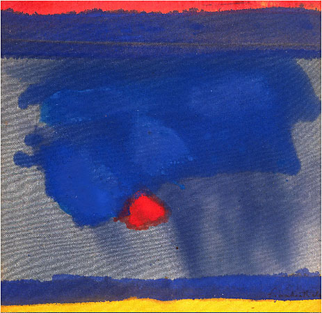
Helen Frankenthaler was innovative in her use of color and it evolved throughout her career. She began exhibiting her large-scale abstract expressionist paintings in contemporary museums and galleries in the early 1950s. Spontaneity was important to her, as the artist stated, “A really good picture looks as if it’s happened at once.”
In the 1960s, she began to place strips of colors near the edges of her paintings, thus involving the edges as a part of the compositional whole. She began to make use of single stains and blots of solid color against white backgrounds, often in the form of geometric shapes. By the 1970s, she started using thicker paint that allowed her to employ bright colors almost reminiscent of Fauvism. Throughout the 1970s, Frankenthaler explored the joining of areas of the canvas through the use of modulated hues, and experimented with large, abstract forms. Her work in the 1980s was characterized as much calmer, with its use of muted colors and relaxed brushwork.
Henri Matisse and Color to Express Light
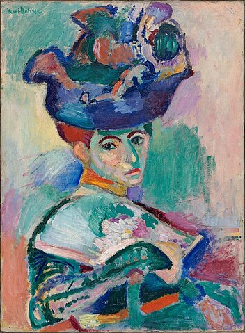
Henri Matisse stated, “The chief function of color should be to serve expression. Colour helps to express light, not the physical phenomenon, but the only light that really exists, that in the artist’s brain.” He also wrote, “Before, when I didn’t know what colour to put down, I put down black. Black is a force: I depend on black to simplify the construction. Now I’ve given up blacks.”
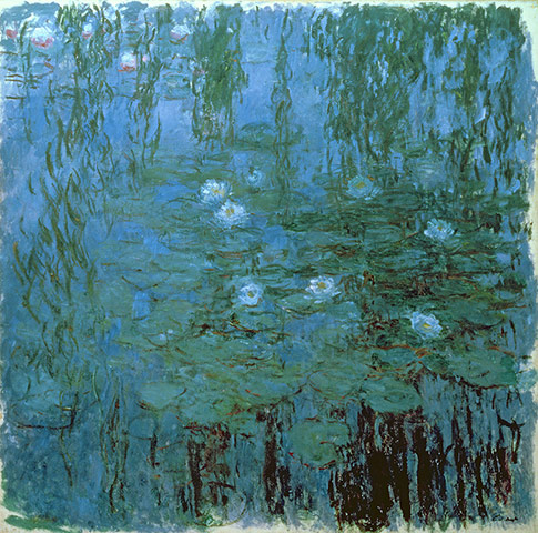
Claude Monet’s Obsession With Color
Claude Monet exclaimed, “Color is my day long obsession, joy and torment.” As he studied color he repeatedly painted the same subject at different times of day and in different weather conditions. He studied how light affects color on subjects. He reworked these paintings in his studio, as he explored a myriad examples of colors and moods.
When giving advice to artists he wrote, “When you go out to paint, try to forget what objects you have before you, a tree, a house, a field or whatever. Merely think here is a little square of blue, here an oblong of pink, here a streak of yellow, and paint it just as it looks to you, the exact color and shape.”
Vincent van Gogh’s Beliefs About Color
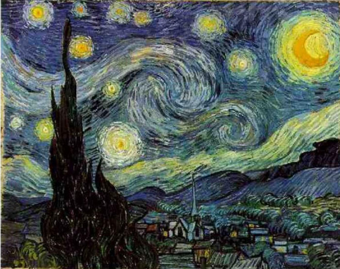
Vincent van Gogh frequently expressed his preoccupation with color in his writings. He wrote, “…the painter of the future will be a colourist the like of which has never yet been seen. But I’m sure I am right to think that it will come in a later generation, and it is up to us to do all we can to encourage it, without question or complaint.”
He was deeply aware of the relationship colors had on each other and wrote, “There is no blue without yellow and without orange.”
Georgia O’Keeffe’s Masterful Use of Color
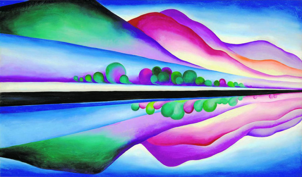
A stunning example of the use of both analogous and complementary colors to create energy and bold contrast with a sense of harmony and balance is Georgia O’Keeffe’s painting “Lake George Reflection”. In this work of art O’Keeffe takes the viewer in the direction she wants us to go.
Opposite colors — shades of red and green — serve to express power and contrast, while analogous colors –red against purple and blue with green — create passages of quiet and calmness. Also notice her use of black and white, racing across the middle of the canvas, without which this painting would not have the same glorious intensity and counterbalance.
Pablo Picasso’s Blue Period
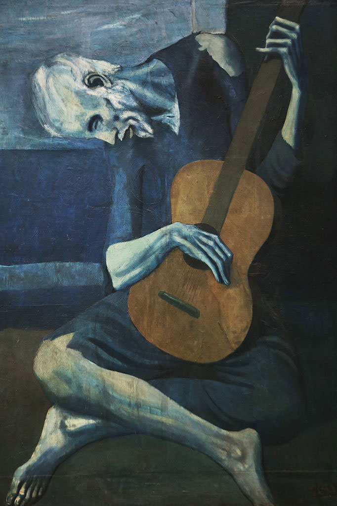
It has been said that Picasso’s three year “Blue Period”, from 1901-1904, expressed his bout with depression following the tragic suicide of his friend Carlos Casagemas. It was a tremendous loss for the artist who changed from his typical gregarious personality to one who sank into a period of despair and recluse. Carl Jung referred to Picasso’s mental state as one of schizophrenia.
Possibly his most well known work from this period is “The Old Guitarist”, which depicts an old beggar in torn clothing, playing the streets of Barcelona, Spain. Picasso’s “Blue Series” series demonstrates how the color blue, when used in heavy doses in the manner in which Picasso used it could propel the viewer into a state of gloom and melancholy.
Color Field Painting
In the 1940’s and 50’s in NYC, NY a style of painting emerged known as “Color Field” painting. This style is characterized primarily by large fields of flat, solid color spread across or stained into the canvas. In this movement color becomes the subject in itself.
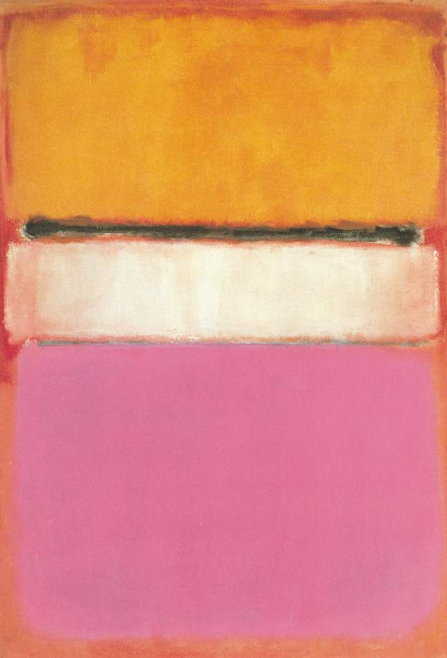
Mark Rothko’s Layering of Color
Mark Rothko was one of the leading pioneers of the “Color Field” movement along with Helen Frankenthaler, Barnett Newman, and Clyfford Still.
Rothko considered color to be an instrument that served a greater purpose which was to evoke our most basic emotions. Each of Rothko’s works was intended to evoke different meanings depending on the viewer. He achieved resonance through the use of layering colors.
The painting “White Center” is part of Rothko’s signature multiform style, in which several blocks of layered colors shimmer on a large canvas.
About Rothko’s work, William S. Rubin, former chief curator of painting and sculpture at MoMA, in NYC, NY wrote, “His colored rectangles seemed to dematerialize into pure light….”
An interesting note according to wikipedia is that some of the colors in Rothko’s paintings faded badly over time due to his use of the pigment Lithol Red together with regular sunlight exposure.
Fernand Léger’s Quotes About Color
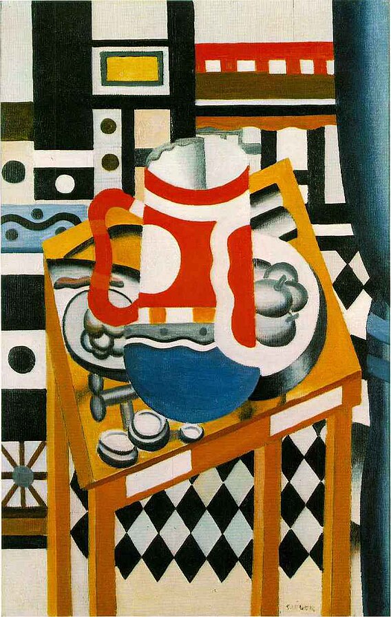
In his “On Monumentality and Color”, 1943, Fernand Leger wrote, “The craving for color is a natural necessity just as for water and fire. Color is a raw material indispensable to life. At every era of his existence and his history, the human being has associated colour with his joys, his actions and his pleasures.”
He also revealed, “I organize the opposition between colors, lines and curves. I set curves against straight lines, patches of color against plastic forms, pure colors against subtly nuanced shades of gray.”
His stylized view of interlocking geometric shapes in a compressed, chaotic compositional space reflects the energy of modern life. Léger honed his Cubist vocabulary, largely with support from the Salon Cubists — painters, sculptors, and critics who produced a more colorful, legible, and public iteration of Cubism when compared to the works of Georges Braque and Pablo Picasso.
Giotto’s Powerful Message With the Color Blue
In most ancient cultures the color gold was was considered to represent the sun and the spirit of God. That changed when Giotto, an Italian painter and architect from Florence during the Late Middle Ages, believed the color blue represented heaven and eternal existence. He became obsessed with the color and painted the ceiling of the Scrovegni Chapel a radiant blue. This was a complete departure from the gold that had been used by previous painters that was associated with opulence and grandeur.
The blue sky that fills a large portion of many scenes in the cathedral provides a unifying and expansive feeling of unlimited possibilities.
The Fascinating Study of Color
This article merely scratches the surface with a small collection of examples in which artists have used color over the ages. I encourage you to explore this subject further and you’ll discover a world of magic awaiting you. You may also want to read “Dozens of Facts About the Power of Color“.

The article is well written. Colour is an ongoing research. I look forward to seeing and reading more.
Thank you Prem. I’m glad you like this article. Please visit the online gallery and you’ll discover many different ways artists use color. And, here’s a link to some art from an exhibition entirely devoted to The Healing Power of Color. We have also organized members’ exhibitions highlighting the Healing Power of Red, Blue, Purple, Yellow, Green, Orange…
Would love to see the exhibition devoted to ‘The Healing Power of Colour’ Is it possible to find it on line?
Hi Christine, The online exhibition “The Healing Power of Color” appeared on this website from May 6 – July 6, 2019. However, we have a few works of art from the exhibition on this page https://www.healing-power-of-art.org/the-healing-power-of-color-exhibition/ You can watch a video with art by 24 artists from the exhibition on our Manhattan Arts International Youtube channel https://www.youtube.com/watch?v=UKjhELAUZs4&t=10s
The things that artists can do with color and paint just blow me away. I love the Monet painting of the water lilies that is featured here. My friend is getting married soon, and would love to have a painter there to capture the significant moments that happen that day. She thinks that would be more unique then just photos.
As always Renee, you introduce us to interesting ways of seeing things. This is a wonderful article and the subject is so close to my heart. Without color I may have chosen another field as it brings joy to my heart.
Lisa, Thank you for your kind words and for sharing your colorful works of art that always express joie de vivre! It is fascinating to see how different hues impact us.
Interesting article, Renee. Wouldn’t you say that Helen Frankenthaler was also one of the pioneers in Color Field Painting?
Yes Patricia, thank you for reminding me to include Helen Frankenthaler, an innovative and influential artist.
I did a blog on color when I was making gemstone jewelry related to the Chakra. Color and light do affect us, whether it’s a physical affect of energy from reflected sunlight, or it’s a psychological affect from related memories stored in our subconscious. I am now creating oil paintings with colors that represent bright light. I use the technique to evoke the emotions of a loving spirit. I enjoy your Healing Power segments. I hope to submit something to your contest soon.
Thank you Cathy. Your jewelry related to the Chakra sounds wonderful. From the awesome paintings I see on your website “Love and Nature”, I’m sure your entries for our Healing Power of Color online exhibition will be very moving. Best wishes for creative bliss!
Deep insights Renee Phillips gives in this article about the role of color. Once a juror said I was a colorist, perhaps most artists are.
Thank you, Renee, as your Art History lesson is excellent.
Thank you Susan. I think your juror was correct. In my opinion, although many artists may use color, it takes an exceptionally sensitive and skilled in caring about or knowing how to apply it to communicate their feelings and ideas. I’d love to know how you describe your use of color!
Thank you Renee for a wonderful insightful article. As a strong colorist myself, I truly appreciated your direct approach and research through artists statements. I am also delighted at your idea to use the subject as a way of bringing about more groundbreaking ways of communication through art exhibitions. Bravo – bravissimo!
Hi Keith, I appreciate your comment and intrest in our upcoming exhibition about “The Healing Power of Color”. It’s an exhibition I look forward to with excited anticipation. It will be a winner, based on the wonderful entries coming in. All the best to you, Renee
Really enjoyed this article Renee. My work is all about color, so I can relate so well to what the masters’ thoughts on the subject.
Reneē,
Wonderful article about color and artists. Reading it was like being back in college Art History Class. Your article reminded me of the importance and beauty of color in artworks. And, the major way color effects artists and art viewers. I really enjoyed reading it.
Thanks,
Casey
Dear Casey, I’m glad you enjoyed the article I wrote about color in art. Writing it was like being back in school for me too. 🙂 It took a lot of restraint to prevent myself from including more on the subject. I look forward to presenting The Healing Power of Color online art exhibition and letting artists share their art and statements about their relationship with color. Wishing you creative bliss, Renee